Same Mission, New Look: Evolving the PayByPhone Brand

At PayByPhone, our mission has always been clear - to simplify journeys so people can focus on what matters most. But as our business has grown, so have the expectations of our users, clients, and communities. The way we show up - visually and experientially - needs to keep pace. That is why, as we rebuilt our app, we also decided to refresh the PayByPhone brand.
We wanted our new brand identity to be rooted in what people already know and love about PayByPhone - bold, fresh, simple, and recognisable - but with thoughtful updates that make it more accessible on all platforms and more scalable for other applications – beyond parking. And just like our new app, this refresh lays the foundation for everything to come.
What’s changed?
A more accessible colour palette

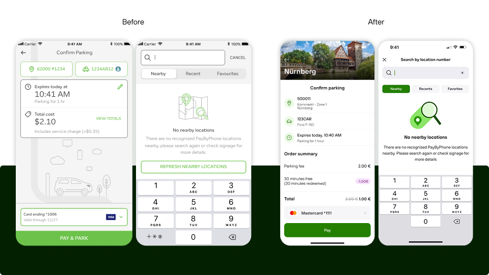
We have used our signature green for years – it is iconic and instantly recognisable. But following an accessibility review, we realised some of our colour combinations (especially green and grey) didn’t meet high levels of contrast ratio standards, making content sometimes hard to read for some users - even those without visual impairments.
So, we have made a couple of key updates:
• We have introduced a deeper green for better contrast
• We have replaced grey tones with a more legible, fresh green palette
We have retained our much-loved nine dots and journey line to stay true to our identity but with the changes in colour, the brand already feels cleaner and bolder, and its contrast ratios are significantly improved - while still unmistakably PayByPhone.
A custom font, built for clarity

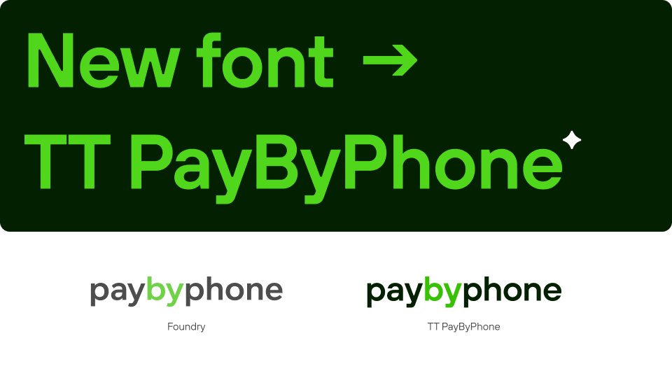
We have also introduced TT PayByPhone - a new custom font created in partnership with leading type studio TypeType. The font is designed to be flexible, energetic, and most importantly, clear and readable at every size.
From in-app text to marketing materials, TT PayByPhone helps us speak with one consistent, accessible voice - across all channels and in every language we support.
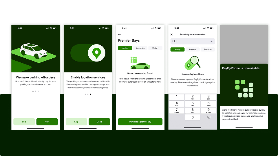
Illustrations that bring our brand to life

We have also updated our illustration style to feel more functional and friendly. Our new system uses simplified shapes, bold contrasts, and geometric lines to guide users without distracting from the experience.
From icons for fuel types and support, to larger visuals on welcome screens, this new system brings warmth and clarity to every part of the journey - whether someone is navigating the app or reading about us online.
Why it matters
This isn’t just a visual update - it’s a step toward a more cohesive, inclusive, and scalable brand experience. We want to ensure that PayByPhone feels consistent, familiar, and clear across every touchpoint - from the app to our website, signage, and communications.
And just like the new app, it’s a foundation for the future: whether it’s delivering new features, expanding our global footprint, or supporting more modes of mobility, our refreshed brand gives us the flexibility to grow - while staying rooted in our promise to simplify journeys.
Looking ahead

The new visual identity is already live in the app, and will roll out across all our marketing materials in the weeks and months to come.
We’re proud of where we’ve come from. And with this refreshed brand in place, we’re ready for everything that comes next.
We hope you like it!